The OfficePortal dashboard provides a comprehensive view of payroll expenses throughout the financial year, utilizing graphical representation via column charts and tabular displays for different datasets. Here’s how it’s structured:
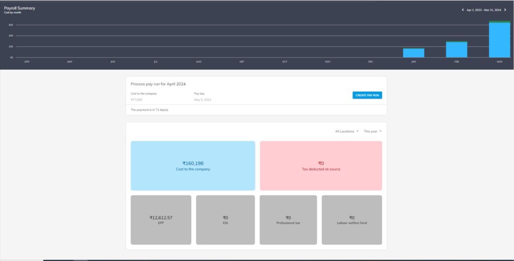
- Graphical Representation of Monthly Payroll Expenses:Utilizes a column chart to visually represent monthly payroll expenses.Provides filters for viewing data on a monthly and yearly basis.Numerical values are displayed alongside the chart for precise data analysis.
- Tabular Display for Different Data Sets:Cost to the Company: Presents a tabular breakdown of the total cost incurred by the company for each employee, including salary, benefits, and other expenses.Tax Deducted at Source (TDS): Displays the amount of tax deducted from employees’ salaries at the source.Employee Provident Fund (EPF): Provides details on the contributions made by both employees and the employer towards the EPF scheme.Employee State Insurance (ESI): Shows the contributions made towards ESI, which provides medical and cash benefits to employees.Professional Tax: Presents the amount of professional tax deducted from employees’ salaries, if applicable.Labour Welfare Fund: Displays contributions towards the welfare of laborers, as mandated by labor laws.
- Filtering Options:Enables users to filter data sets based on different parameters such as month and year, allowing for focused analysis and comparison.
Overall, this dashboard offers a comprehensive overview of payroll expenses, allowing stakeholders to understand the distribution of costs and deductions, track trends over time, and ensure compliance with regulatory requirements.